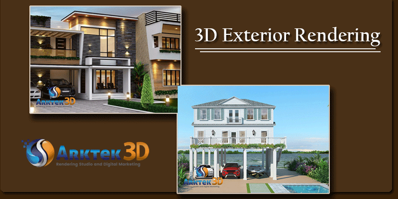
When crafted with all the details in mind, renderings can be an incredible way to tell a story of an amazing architectural marvel. With powerful tools accessible to the architects, they can conjure highly detailed iterations that are virtual but look utterly real. Wooing your clients with amazing images of the project can be the go-to move.
However, even the best architect can fail at times. Apparent misuse of the tools is the prime reason for the same. With wrongly used architectural tools, the resulting project for 3D exterior rendering can cause a lack of clarity with a sense of deceptiveness. The images that are misleading will ultimately break you off from cracking a good deal with potential clients.
To help you achieve the best out of your efforts for 3D Exterior rendering, you need to avoid these common mistakes.
1- Rendering Reflections:
Two among the highly challenging materials that help accurately replicate the renderings for your projects are mirrored and glass surfaces. Make the mirror facades a bit too flawless or the glass a bit too transparent, and the image can appear misleading. Such surfaces are always challenging when it comes to realistic visualizations. However, even if you have accurate tools by your side, the reflections can go wrong. It is your expertise and experience in the matter that helps create realistic representations. Do not aim for something too perfect or surreal.
So, when crafting the best reflections for 3D Exterior renders, you should always go with your guts. Of course, an excellent tool surely helps!
2- Placing Tress atop Skyscrapers:
The green initiative is one of the best things to happen to the world of architecture. However, you do not need to go overboard in terms of placing trees over the skyscrapers. As an architect, you need to ask yourself what is the appropriate amount of green that can be added to such buildings. With 3D exterior rendering process, you need to keep in mind that trees can be represented a bit too far from the actual reality.
At times, the architects can stray off from practical realities that combine the instances of architecture with arboriculture. You wouldn’t want 10-foot-high trees to be a part of the skyscraper.
3- Recycling the Scale People:
The scale people are used mostly for the clients to get an idea of how large the project is. However, there might be times when you run out of these variants. Many architects tend to recycle their scale-people collections. Now, if you had the same set of clients for years, it can distract them from the architectural marvel you just created. Your viewers or clients might focus more on the recurring scale people as opposed to the things you have added to your architectural project.
So, the right way to avoid such unnecessary distractions is to go for a vast library that comes with a plethora of scale people options to choose from. This mistake for 3D exterior rendering can be avoided if you refrain from overuse of the scale people in a repetitive manner.
4- Recycling the Scale Sculptures:
Just as the scale people used for 3D exterior rendering, the scale sculptures used for the project need to be unique. Of course, there is no harm in reusing them every once in a while. However, you need to refrain from being repetitive. Using a generic prop for every project will lead to your project seeming like a blatant copy. Not just that, it will distract you from the prime attraction of the 3D exterior rendering project.
5- Wrong Perspective:
To create something that is immersive as well as believable in terms of visualization, you need to use the right camera angle. This is a common pitfall that should be avoided when creating any powerful perspective. To capture the image for top part of the 3D exterior rendering project, you need to set a perspective that is 10 feet atop the real ground.
For exterior renderings, perspective is everything. Craft your project from a wrong angle, and your project would seem to tight fitted or distorted to the clients.
6- Going Crazy with Sci-Fi inclusions:
Every architect is a sci-fi lover on his own. He/she takes up ideas from the popular sci-fi series or movies to create amazing renders. A render atmosphere with unique designs tells compelling stories for the clients or viewers of the project. At times, architects go haywire with principles of sci-fi taken a bit too far.
It has become increasingly common for the architects to create project scenes that look something like an image straight from the science-fiction stories. The project can be packed with extraordinary weather conditions or otherworldly lightings. Even though these renders might look impactfull, they can distract from the actual 3D exterior rendering crafted by an architect. Keeping it minimal is the key.
Bottom Line
While a realistic, glossy rendering can be convincing enough for the developer to say yes for the project, it hides out the real feel of the architectural images and drawings. The key is to maintain a subtle balance between what’s real and what isn’t.
Planning a new architectural project for your client? Get in touch with our expert architects at Arktek 3D and get access to amazingly innovative 3D renders. Give us a call at 904-377-7088 or mail us your detailed requirements at info@arktek3d.com.

